
Here is a quite common business need: you want a dashboard that shows “all about” something (a customer, a host, an IP address, etc.), using the latest fresh data.
To compose this, which is often referred to as a “360-degree view”, you will very often need to show data coming from many different indexes (e.g. on Elasticsearch) but possibly also from different backends.
Obviously, you’d also like one such dashboard to be “drillable”, like the regular ones: a filter on something should correctly filter all the “connected” visualizations, no matter which “related” data (or index) they’re getting the data from.
How to get this?
A sophisticated BI feature, now available for “operational data” use cases.
So far, state of the art BI systems allowed this, while “live big data” operational tools have not.
Qlikview for example (and to a much lesser extent Tableau) allows one to create associative data models and one can then create dashboards in which coherent filtering happens. They call this “associative advantage”, and it has been, historically, quite amazing stuff.
To do this, however, they employ fully in memory backends, which require ETL, or, similarly, materialized views both of which are no-nos for dashboards that need to operate on live big data.
Systems like Tableau and many others simply use a “join view”, but this has a lot of shortcomings especially in terms of performance, but also manual work when creating / updating datamodel and dashboards.
As mentioned, in the “Operational, big data” world, this has so far not been possible at all, with Kibana / Grafana/ Splunk not supporting this.
With release 10.3 of Siren, we’re excited to say this is no more the case.
Siren new “Dashboard 360”, which makes use of the Siren Federate technology for Elasticsearch, achieve in dashboard fully live/drillable 360 degrees dashboards. Let’s take a look.
The 3 kinds of dashboards in Siren
The new “Dashboard 360” comes as an extension of the Siren “relational” dashboards (where one can navigate from one dashboard to another via “what’s connected” to the individual records).
Let’s see this in detail.
Every dashboard in Siren allows one to choose between one of 3 dashboard data model settings:
Each of these has increasing capabilities:
Dashboards that do not represent a Search (your standard dashboard)
(Note: for all the examples we’ll use the data from our “classic demo” – crunchbase companies/investments/investors/articles – Watch our intro video here. Find our tutorial here)
Dashboard “that does not represent a specific search” is your standard Kibana/Grafana/Logzio like dashboards.
As a reminder, they work as follows:
- You build “visualizations” (e.g. a pie chart showing “Company Countrycodes”) and add them as tiles
- Each visualization is built on top of a predefined table/search, e.g. “companies” (so it knows where to get the data) and typically creates filters on click e.g. “Countrycode = UK”
- When a filter is created, this is propagated in turn to all the other visualizations
These are, of course, very powerful, but do have notable limitations:
- Limitations on the use of multi-table visualization. Technically, e.g. in Kibana, you can add visualizations from different tables on the same dashboard but then filtering typically will not work coherently. For example, putting our “countrycode = UK” will result in any visualization on “investments” – which does not have countrycode as a field – to simply go blank. The “total amount” visualization to display 0, as the investment table will typically have no field “countrycode” (Only exception here is if one denormalizes and replicates the same data in both indexes)
- You can’t relate the results of a dashboard to that of another. In other words, you have no way to go from a set of companies (e.g. US companies) to the “set of investments they have received” (to see the total) – a key ability in Siren deployments.
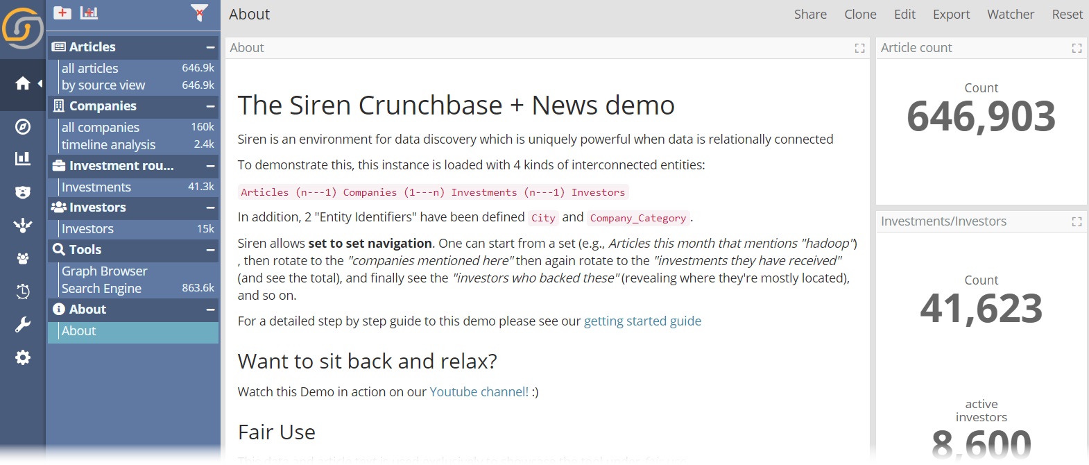
For these reasons, in Siren “Dashboards without a search” are not used often, but they’re still useful to create “overviews” and informational pages e.g. the About page in our “Classic Demo” (notice how we disable the search and filter bar in this case for clarity, a new option in Siren 10.3):
Dashboards that do represent a search (dashboard → data model binding)
A second option is to specify that a dashboard is about a specific table/search (for example, it talks specifically about companies)
This is a “dashboard to data model” binding and enables the following:
- The dashboard displays the count on top (and in the sidebar), and the icon associated with the search in question
- Relational navigation activates: The Dashboard can host a visualization called “relational navigator” which will allow you to move from the set of currently selected companies, for example, to the “set of their investments” (at Elasticsearch scale). The dashboard also becomes a possible “target” for relational navigation from other dashboards.
- You can drag and drop these dashboards from the Sidebar into the Graph Browser or into the Siren Map, and the records will be added and visible in Link analysis or as a Layer on the map.
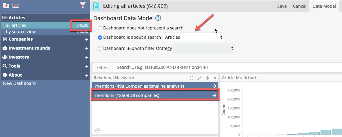
For example, in the following screenshot (from the tutorial demo) this dashboard is set to be about the Articles search. This makes the Relational Navigator component (blue buttons) work and shows the count (646,902) on top and on the sidebar.
The Next Step: Introducing Siren “Dashboard 360”
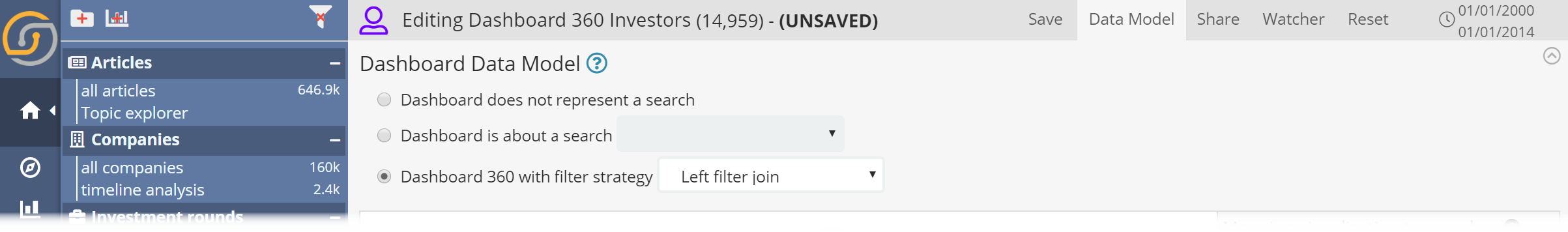
With Siren 10.3, we’ve launched the “Dashboard 360” feature which allows you to visualize data across different tables(searches) and apply filters coherently across visualizations using a dashboard (or use case) specific data model.
This is how the configuration of the “Investor 360” dashboard in our demo looks like. It’s a full example so bear the apparent complexity.
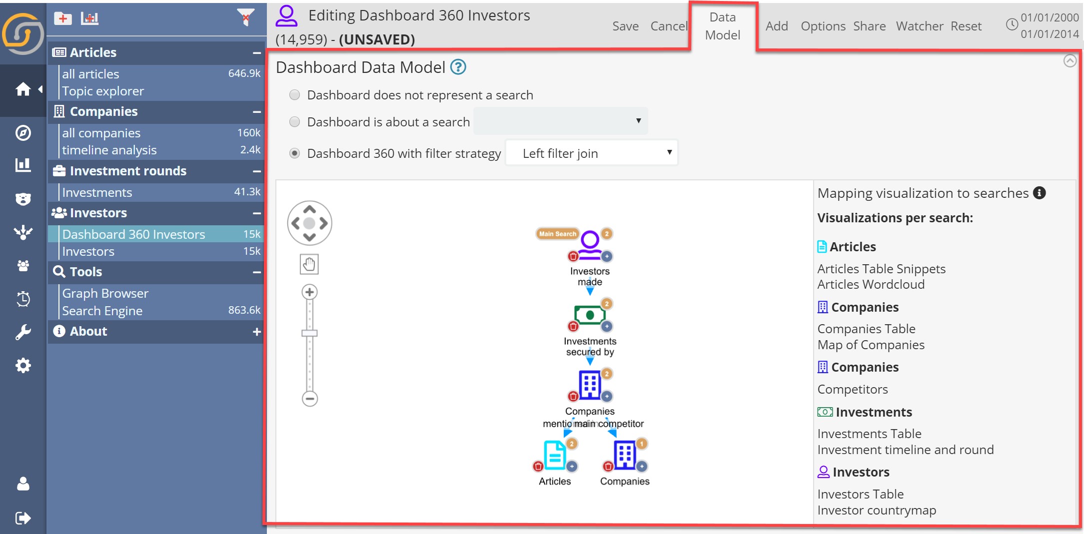
In the left panel, we see a graphical representation of the dashboard specific associative data model: it starts with the “Main Search” (top node), in this case, Investors (which then made Investments secured by Companies which can be mentioned in articles – or have competitors).
On the right, the list of visualizations in the dashboard and an interface to “bind them” to specific nodes: Just click on a node and select a visualization from the list to be “bound” to it.
Interestingly, in this example we have the same search twice: companies appear one time as “the companies which have received investments from investors” and another as “their competitors”.
Thanks to the explicit assignments of visualizations to search nodes in the tree, at runtime Siren will calculate all the “implicit join path” to coherently apply filters to the queries that power the visualizations.
The result? Correct and coherent results and freedom to drill down along any dimension – for seamless and informative user experience.
Let’s see this in action.
For a better understanding of the mechanism, I have clicked on the map to select “countrycode: DEU” (German Investors) and also “round_code: seed”. Let’s walk through the full screenshot under this condition:
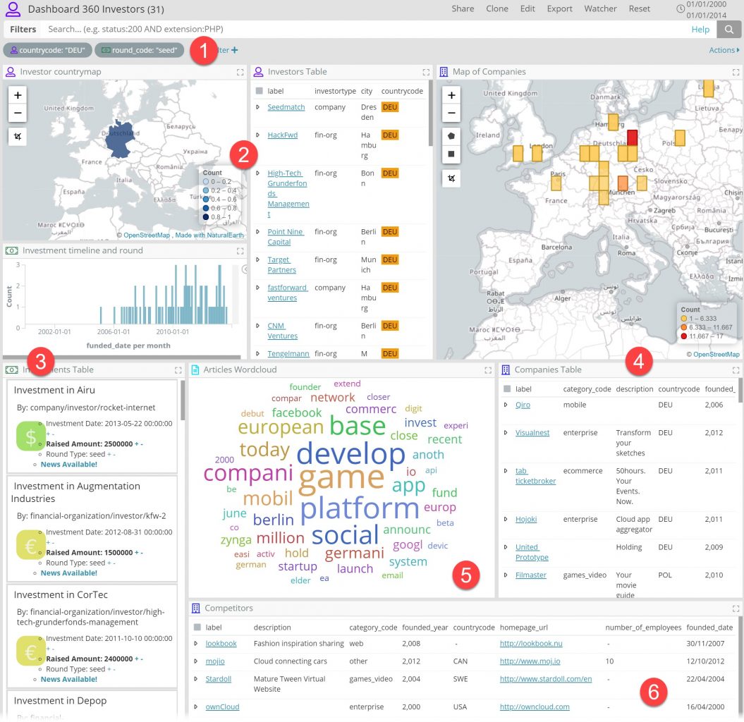
In Dashboard 360 mode, the two filters (1) show an icon which clarifies which search they’re applied on. Matching icons are shown on top of each visualization.
What’s most exciting, however, is that view is now completely coherent, in the associative data sense:
- we see who the German Investors are (that have made seed investments) in (2) …
- … the timeline, and details of the investments they made (3) …
- … the map and the list of the companies who secured these invested in (4) …
- … the tag cloud of the articles that mention these companies (5)
- … the list competitors (6) for said companies
The result: a guaranteed coherent interactive “360-degree view” around one entity (or a set of entities, like in this case).
What’s more exciting: no materialization of data took place so the result is very easy to set up and maintain: if you have a new index tomorrow that might be useful to add to this view, you can simply add a new branch in the associative data model and add the corresponding visualizations.
A credit card fraud example (on live streaming Elasticsearch data)
A number of automatic methods exist for flagging transactions as “suspicious” but at the end of the day, it’s critical for an operator to review a few cases, e.g. to unblock certain transactions or review the flagging system itself.
This is the dashboard 360 that powers the review system at Pay360, by Capita, used to review transactions that are stored in Elasticsearch indexes.
A transaction is a record having several pieces of data such as:
- User ID
- Credit Card Number
- Merchant ID
- IP of the transaction
For a “360 exploration” each of these metadata fields will act as “dimensions”. Which other transactions does the same UserID typically make? The same CreditCardNumber make? The same IP make?
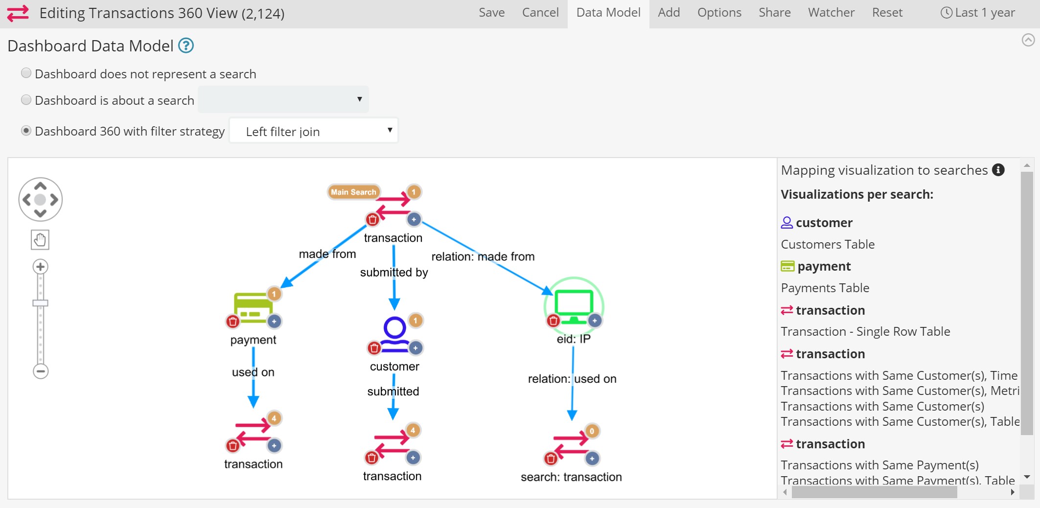
To answer this (at a glance) we create a Dashboard 360 data model centered around transactions (e.g. a single or a group) and relating other transactions via association with the different dimensions. This is done with a configuration like this:
Which results in a dashboard where we can see all this at a glance:
Here, the regular visualizations are also coupled with a Graph Browser which, despite not being bound directly to the associative data model, can be automatically and precisely populated as soon as the dashboard is opened (previewing Siren 10.4 scripting capability here).
At the bottom of a dashboard, a scripted visualization allows an operator to write annotations and with buttons to approve or reject the transaction in question.
Performance and Availability
Dashboards 360 are available in Beta in Siren 10.3 so get it now and let us know how they go for you. In terms of performance, they are, of course, more “intense” than regular Dashboards so find what works better for you and possibly split a dashboard 360 into two different ones if you have many indexes you want to use at the same time (and deep relational paths).
We also have many optimizations in the roadmap (both at federate and at the frontend level) which will further enhance performance in 2020.
Conclusion
Being able to correlate data across different indexes (but also data sources) is core in many enterprises and otherwise complex data scenarios.
In the Elasticsearch world, at scale, cross-index data correlations become possible thanks to the Siren Federate technology which, coupled with an associative data model, has to this day powered data investigations in Siren via the staple “relational navigation” feature.
With 10.3 we’re excited to push this further with “Dashboards 360”: associative data model-driven dashboards which enable “at a glance”, interactive overviews over complex, interconnected data scenarios.
Dashboard 360 are the first of this kind in the operational/big data world – delivering increased dashboard expressiveness and decreased cognitive load for important live data scenarios.
Get it now and let us know what you think!


